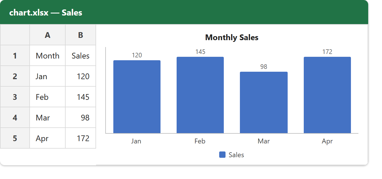
This article shows how to create an Excel chart with the latest version of PhpSpreadsheet. We write a small table of monthly sales, then create a column chart from those cells and embed it in the same worksheet — a real, editable Excel chart, not a picture pasted on top.
Charts take a few classes because a chart has a few parts. DataSeriesValues points at the cells for the values, the category labels, and the series name. DataSeries bundles those together and sets the chart type — TYPE_BARCHART drawn in the column direction. PlotArea, Legend and Title describe how it looks, and Chart ties them into one object that addChart() anchors onto the sheet. The one easy-to-miss step is telling the writer to include it: setIncludeCharts(true).
A chart turns a column of numbers into something a reader takes in at a glance, which is exactly what a spreadsheet is often built to deliver. Once the wiring makes sense, switching from columns to a line or a pie chart is a one-constant change — so build this one first, then reshape it.
Requirements to create an Excel chart:
- Composer
- PHP 8.2 or newer
Step 1.
First, set up the dependencies. Here we pin the latest major release of PhpSpreadsheet (the 5.x line).
{
    "require": {
        "phpoffice/phpspreadsheet": "^5.0"
    }
}
Step 2.
Next, install phpspreadsheet.
$ composer install
Step 3.
Then create a new PHP file. Load Composer’s autoloader and import the classes the chart is built from.
<?php

require 'vendor/autoload.php';

use \PhpOffice\PhpSpreadsheet\Spreadsheet;
use \PhpOffice\PhpSpreadsheet\Writer\Xlsx;
use \PhpOffice\PhpSpreadsheet\Chart\Chart;
use \PhpOffice\PhpSpreadsheet\Chart\DataSeries;
use \PhpOffice\PhpSpreadsheet\Chart\DataSeriesValues;
use \PhpOffice\PhpSpreadsheet\Chart\Legend;
use \PhpOffice\PhpSpreadsheet\Chart\PlotArea;
use \PhpOffice\PhpSpreadsheet\Chart\Title;
Step 4.
Write the data the chart will plot. A chart never holds its own numbers — it points at cells — so the table has to exist first.
$spreadsheet = new Spreadsheet();
$worksheet = $spreadsheet->getActiveSheet();
$worksheet->setTitle('Sales');

// The data the chart plots.
$worksheet->fromArray([
    ['Month', 'Sales'],
    ['Jan', 120],
    ['Feb', 145],
    ['Mar', 98],
    ['Apr', 172],
]);
Step 5.
Point at the cells with DataSeriesValues. One set for the category labels (the months in A2:A5), one for the values to plot (the sales in B2:B5), and one for the series name (the Sales header in B1, used in the legend).
// The category axis — the Month labels.
$categories = [
    new DataSeriesValues(DataSeriesValues::DATASERIES_TYPE_STRING, 'Sales!$A$2:$A$5', null, 4),
];

// The values to plot — the Sales numbers.
$values = [
    new DataSeriesValues(DataSeriesValues::DATASERIES_TYPE_NUMBER, 'Sales!$B$2:$B$5', null, 4),
];

// The series name — the "Sales" header in B1.
$labels = [
    new DataSeriesValues(DataSeriesValues::DATASERIES_TYPE_STRING, 'Sales!$B$1', null, 1),
];
Step 6.
Now build the chart. First bundle the values into a DataSeries and set the type — TYPE_BARCHART with setPlotDirection(DIRECTION_COL) gives vertical columns. Then wrap it in a PlotArea, add a Legend and a Title, build the Chart, position it by its top-left and bottom-right cells, and attach it with addChart().
// A bar chart, drawn as vertical columns.
$series = new DataSeries(
    DataSeries::TYPE_BARCHART,
    DataSeries::GROUPING_CLUSTERED,
    range(0, count($values) - 1),
    $labels,
    $categories,
    $values
);
$series->setPlotDirection(DataSeries::DIRECTION_COL);

$plotArea = new PlotArea(null, [$series]);
$legend = new Legend(Legend::POSITION_RIGHT, null, false);
$title = new Title('Monthly Sales');

$chart = new Chart('sales-chart', $title, $legend, $plotArea);

// Anchor the chart onto the worksheet.
$chart->setTopLeftPosition('D2');
$chart->setBottomRightPosition('J17');
$worksheet->addChart($chart);
Step 7.
Finally, save the file. The writer skips charts unless you ask for them, so call setIncludeCharts(true) before save() — forget it and the file opens with the data but no chart.
// The writer only emits charts when told to.
$writer = new Xlsx($spreadsheet);
$writer->setIncludeCharts(true);
$writer->save('chart.xlsx');

echo "Done. Wrote chart.xlsx with a column chart.\n";
Complete code to create an Excel chart.
<?php

require 'vendor/autoload.php';

use \PhpOffice\PhpSpreadsheet\Spreadsheet;
use \PhpOffice\PhpSpreadsheet\Writer\Xlsx;
use \PhpOffice\PhpSpreadsheet\Chart\Chart;
use \PhpOffice\PhpSpreadsheet\Chart\DataSeries;
use \PhpOffice\PhpSpreadsheet\Chart\DataSeriesValues;
use \PhpOffice\PhpSpreadsheet\Chart\Legend;
use \PhpOffice\PhpSpreadsheet\Chart\PlotArea;
use \PhpOffice\PhpSpreadsheet\Chart\Title;

$spreadsheet = new Spreadsheet();
$worksheet = $spreadsheet->getActiveSheet();
$worksheet->setTitle('Sales');

// The data the chart plots.
$worksheet->fromArray([
    ['Month', 'Sales'],
    ['Jan', 120],
    ['Feb', 145],
    ['Mar', 98],
    ['Apr', 172],
]);

// The category axis — the Month labels.
$categories = [
    new DataSeriesValues(DataSeriesValues::DATASERIES_TYPE_STRING, 'Sales!$A$2:$A$5', null, 4),
];

// The values to plot — the Sales numbers.
$values = [
    new DataSeriesValues(DataSeriesValues::DATASERIES_TYPE_NUMBER, 'Sales!$B$2:$B$5', null, 4),
];

// The series name — the "Sales" header in B1.
$labels = [
    new DataSeriesValues(DataSeriesValues::DATASERIES_TYPE_STRING, 'Sales!$B$1', null, 1),
];

// A bar chart, drawn as vertical columns.
$series = new DataSeries(
    DataSeries::TYPE_BARCHART,
    DataSeries::GROUPING_CLUSTERED,
    range(0, count($values) - 1),
    $labels,
    $categories,
    $values
);
$series->setPlotDirection(DataSeries::DIRECTION_COL);

$plotArea = new PlotArea(null, [$series]);
$legend = new Legend(Legend::POSITION_RIGHT, null, false);
$title = new Title('Monthly Sales');

$chart = new Chart('sales-chart', $title, $legend, $plotArea);

// Anchor the chart onto the worksheet.
$chart->setTopLeftPosition('D2');
$chart->setBottomRightPosition('J17');
$worksheet->addChart($chart);

// The writer only emits charts when told to.
$writer = new Xlsx($spreadsheet);
$writer->setIncludeCharts(true);
$writer->save('chart.xlsx');

echo "Done. Wrote chart.xlsx with a column chart.\n";
Test creating an Excel chart.
Command line testing.
$ php create-chart.php
Result of creating an Excel chart.
Running the script to create an Excel chart writes chart.xlsx. Opening it shows the four-row sales table on the left and, anchored beside it, a clustered column chart titled Monthly Sales with one column per month and a Sales legend — a live chart that updates if you edit the numbers.
$ php create-chart.php
Done. Wrote chart.xlsx with a column chart.